Tuesday, March 28, 2017

Conducting a Distance Azimuth Survey

Introduction

  Sometimes, technology fails; whether it be dead batteries or bad pixels on a GPS screen, technology is never 100 percent reliable. When this is the case, a distance azimuth survey can be conducted using basic non-technologically advanced tools. There are two different kinds of survey data: explicit and implicit. Explicit survey data is collected using a GPS unit or another geospatial device which will provide a point's exact geographic location. Implicit survey data is location data relative to a specific geographic location. A distance azimuth survey is a good example of using implicit survey data. This is because a distance azimuth survey is based off of a single reference point which all other survey points will be based on. The reference point is collected using a GPS unit, but all the other survey points can be collected using tools as simple as a compass and measuring tape.
Photo of the Study Area Where the Survey  was Conducted
Fig 7.0: Photo of the Study Area Where the Survey
was Conducted
  In this lab, a distance azimuth survey will be conducted in Putnam park which is about 100 meters south of Davies Center's front entrance on UW-Eau Claire's campus in Eau Claire, WI. This is a fairly wooded area which is located at the base of the hill which separates lower and upper campus. A photo of the survey area is shown on the right in figure 7.0.
   The survey will consist of measuring the distance and azimuth of random trees from the survey reference point. The diameter of each tree will also be measured. The survey will be broken up into three different sections each located in slightly different areas. Each area will have a survey of 10 trees which will correspond to a reference point. Also, in each area, a different combination of tools will be used to gather the distance and azimuth. However, the GPS and diameter tape will be used at each area to capture the geographic coordinates of the reference point, and to measure each tree diameter. An image of the GPS unit used is shown below in figure 7.1. In total, there will be three different reference points and
30 different trees surveyed.
GPS Unit Used to Capture Explicit Survey Data
Fig 7.1: GPS Unit Used to Capture Explicit Survey Data


Methods

Area 1
TruPulse Laser Used to Capture Azimuth and Distance
Fig 7.2: TruPulse Laser Used to Capture Azimuth and Distance 
Survey Data
  This area is located at the base of the stairs between McPhee and Davies Center. First, the GPS unit was used to find the coordinates of the reference point. Then, 10 random trees were chosen to be used in the survey. The azimuth and distance of these trees were then measured based off of the reference point using the TruPulse laser which is shown on the right in figure 7.2. The laser was pretty simple to use. When collecting the azimuth and distance data with the laser, one just needs to press the top button on the top to shoot the laser at the tree while making sure that the laser was on the correct setting. When doing this, it is important to make sure that there isn't anything in-between the laser and the tree so that an accurate reading is made. After this, the diameter of the trees were collected by using the diameter tape. After the data for the 10 trees were collected, they were then written down in a notebook to be used later.


Area 2
Fig 7.3: Using the Azimuth Compass
to Measure the Bearing
  This area is located about 100 meters southeast of area 1. The GPS unit was used again to record the reference point which would be used to base the survey on. Next, 10 more random trees were chosen to surveyed. Then, the unique tools were to collect the azimuth and distance for each tree. These unique tools included the azimuth compass which was used to measure the bearing (displayed in figure 7.3) and measuring tape which was used to measure the distance between the reference point and the trees. The azimuth compass was fairly difficult to use. One eye had to read the bearing on the compass while looking through a very small lens and the other eye had to be looking at the tree to make sure the bearing was on line. Lastly, the diameter tape was used to measure the tree diameters at chest height. Figure 7.4, below, shows Alex using the diameter tape. On the diameter measuring tape there was a metal hook which hooked into the tree and then the tape was wrapped around the tree and measured at the hook to see what the diameter was. After this data was collected for the 10 trees, it was written down in the same notebook as before.
Using Diameter Tape to Measure Tree Diameter
Fig 7.4: Using Diameter Tape to
Measure Tree Diameter

Area 3
  Area 3 is located 100 meters southeast of area 2. Once again, the first step was to record the coordinates of the reference point using the GPS unit. The second step was to choose 10 random trees to survey out. Then, the Sonin sound wave device was used to measure the distance from the reference point to each selected tree. An image of our group using the Sonin device is shown below on the left in figure 7.5 and a closer image of just the Sonin device is shown below on the right in figure 7.6 . It took two people to use the Sonin device as there are two parts to it. One person had to stand at the reference point with one part while another had to stand at the tree with the other. Then, the person standing at the reference point would shoot the sound wave from their part of the Sonin device to the other Sonin device and the distance reading between the two Sonin devices would display on the screen. Then, the azimuths were measured using the azimuth compass tool just like in area 2, and the the tree's diameter was measured with the diameter tape. Then, this data was recorded in a notebook next to the other data.
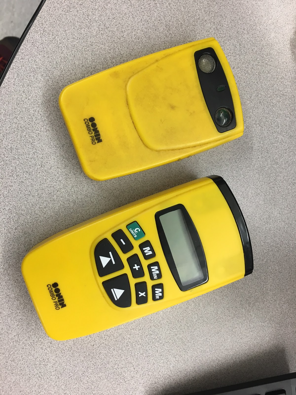
 Close up View Of the Sonin Device
Fig 7.6: Close up View Of the Sonin Device
Using the Sonin Sonar Device
Fig 7.5: Using the Sonin Sound Wave Device
Normalizing the Data in Excel
  Since all of the data collected for the survey was recorded in a notebook, the data had to be entered into excel. 24 entries out of the 30 can be seen below in figure 7.7. Each field was given a very standardized name such as X, Y, or Azimuth so that the data will be easier to add to ArcMap when making the maps. The Distance field is measured in meters, the azimuth field is measured in degrees, and the diameter field is measured in meters.
Excel Survey Standardized Data
Fig 7.7: Excel Survey Standardized Data
Bringing the Data into ArcMap
  The Bearing Distance to Line tool was used to bring the the data into ArcMap. This tool asks for the reference coordinate values, the distance values, and azimuth bearings of the surveyed trees. From this, the tool will generate a series of azimuth lines which will represent the distance and bearing of each tree from the reference point.
  After that, the Feature Vertices to Points tool was used. This tool creates vertices at the end of line segments for a feature class. All that had to entered in was the line feature class just created above, and the new output point feature class. Doing this created points for each individual tree and for the reference points. Unfortunately, it created 10 points at each reference point because there were 10 line segments which had a vertex there. These extra points were deleted within an edit session because they were unnecessary. A new feature class was created and three points were added manually to display the reference points.
  After both of these tools were ran, there were both lines and points which represent the location of the trees, and the distance and azimuth of them.

Issues Encountered While in the Field
  The first issue encountered happened while using the TruPulse laser to measure the distance and azimuth in area 1. Sometimes it was difficult find the tree while looking through the lens because there was some brush in the way and the people measuring the diameter of the tree not standing by the right tree. This was overcome by having the person measuring the diameter of the tree go back the tree needing to be measured and then verifying that the measurement was taken with the person with the laser.
  Another issue happened when traveling from the different areas. Each area used a different set of tools to measure the distance and azimuth. However, the same tools were used to measure the coordinates, and tree diameter. Because there were three different groups, there was some confusion whether all the tools were to be left at the area when done surveying the trees in that spot. Some people thought that all the tools should be left at the area, and  some thought that only the tools that changed should be left at the area. This issue happened each time our group moved areas. This issue was never really solved, but was temporarily fixed when arriving at each area. Often, one person had to walk over to the previous area to either drop off some tools or pick some up.
  One other issue encountered happened while collecting data with the Sonin sound wave device. Because it took so short to record the distance and azimuth compared to measuring the tree diameter, the person measuring the tree diameter was consistently behind. For example, the azimuth and distance would be entered for trees one through five, but the diameter would only be through tree three. Eventually, this caused some error in the data because the wrong trees were being measured with the diameter tape and the trees surveyed with the Sonin and azimuth compass had been forgotten. This issue came about after all 10 trees had been surveyed. To fix this issue, a new set of 10 trees was picked out, and our group made sure to record everything very carefully and to not move from tree to tree so quickly.

Results

Maps
  Only one map was created for this lab as there was simply little enough data to fit all the attributes and features on a single map without making it too busy. This map can be seen below in figure 7.8. It is a proportional symbol map where the circles represent the location and diameter of the surveyed trees, the azimuth lines represent the bearing and distance to these trees based off of the reference point, and the yellow stars represent the survey reference points.
  Looking at the map, there isn't any clear spatial connection between tree diameter and anything else. This makes sense as the diameter was the only attribute collected about the tree. It wouldn't logical for the distance or azimuth to be related with tree diameter because they are arbitrary data to the tree and are based of a reference point. The largest tree diameter was 87 cm which is quite large while the smallest tree diameter measured was 18.4 centimeters. In general, the trees surveyed at areas 1 and 2 had a larger range in tree diameter than the trees in area 3 did.
 Proportional Symbol Map Showing the Diameter, Location, Distance, and Azimuth,  of the Surveyed Trees
Fig 7.8: Proportional Symbol Map Showing the Diameter, Location, Distance,
and Azimuth,  of the Surveyed Trees

Data Accuracy
  When first creating the map, the area 1 survey points didn't show up in the correct location. They showed up on the top of the hill near McPhee. This happened because the GPS unit was unable to get a good reading for the reference point. The large hill to the south and the densely wooded area made it difficult for the GPS to receive an accurate signal from satellites. To fix this issue, the actual location of where the reference point was supposed to be was determined by using the information tool and clicking on the correct location in ArcMap with a loaded base map. This gave a new set of coordinates which then had to be reentered into Excel and brought into ArcMap again using the same process as before. The points for areas 2 and 3 looked to be accurate, so those remained unchanged.
  There could have possibly been some data error when using the tools for gathering the distance, azimuth and diameter of the trees while in the field. The diameter of the trees were measured at chest height, but different people measured the diameter of the trees. This could have led to possibly some inconsistency in the measuring location for the diameter. Error could have also occurred if the wrong tree was measured when using the laser or azimuth compass. One error can be seen in area 1 where the one tree located just above the legend is placed. It is unlikely that this is actually the correct location of the tree because this is where the large hill is and our group didn't measure any trees on the hill. Fortunately, the rest of the tree locations look to be accurate.

Conclusion 

  A distance azimuth survey worked well for this lab, but in reality this method should only be used when other better ways of surveying isn't an option. A couple other ways include using a GPS unit to measure every survey point explicitly or creating and using a coordinate system if the study area is small enough such as done in the sandbox lab. The benefits of using an azimuth survey include that it can be performed relatively quickly, it doesn't require expensive tools, and that it is a good backup option when technology fails. Potentially, a distance azimuth survey could be used to map out things such as a golf course, tree type, or even property boundary if the surveyor was careful enough.
  

Thursday, March 9, 2017

Processing UAS Data using Pix4D

Introduction

  Pix4D is a a software program which converts aerial, oblique, and ground imagery into highly accurate georeferenced orthomosaics, 3D surface models, point clouds, contour lines, and more. Pix4D can process data taken from any type of camera. Most images are taken from UAS platforms, but can also be taken from aircraft. In this lab, aerial imagery from the Litchfield mine located south and west of Eau Claire will be used. This imagery was collected in June of 2016 using the Phantom platform. The purpose of this lab is to process this imagery using the Pix4D and describe the process. It is also to generate maps from this processed data. The patterns in these maps will then be described. Before processing the data though, some basic questions will be answered below.

What is the overlap needed for Pix4D to process imagery?
  Generally, the minimum overlap needed to produce quality data is 75% frontal (in the flight direction), and 60% side (between flying tracks).

What if the user is flying over sand/snow, or uniform fields?
  Because the data points would be more difficult to distinguish in these area if a normal flight was taken, it is recommended that to get quality data, the UAS platform be flown higher off the ground and that the minimum overlap is 85% frontal, and 70% side.

What is Rapid Check?
  Rapid Check is a software which can be used in the field to quickly see if the data collected from the UAS platform was sufficient enough. Unfortunately, the results are not always accurate because it processes the the quality of the data very quickly.

Can Pix4D process multiple flights? What does the pilot need to maintain if so?
  Yes. Pix4D can process multiple flights. The pilot needs to make sure that there is sufficient overlap between the flights, and that the flights are taken under very similar conditions (sun angle, weather, traffic, etc.).

Can Pix4D process oblique images? What type of data does one need if so?
  Yes. Pix4D can process oblique images. Multiple images need to be taken at different angles for oblique images to create a quality output. It is recommended that images be taken every 5 to 10 degrees to provide enough overlap between images.

Are GCPs necessary for Pix4D? When are they highly recommended?
  No. GCPs are not necessary for Pix4D. However, it is strongly encouraged that GCPs be used when combining oblique imagery with aerial imagery.

What is the Quality Report?
  The quality report is a report which is automatically displayed once the Initial Processing is completed. It gives the description and status of  the images, dataset, camera optimization, matching, and georeferencing. This report allows the user to see if the data is ready for further processing.

Methods - Processing the Data

Step 1: Create a New Project
 First, Pix4DMapper is opened and a new project is created. It is given the name 20160616_hadley_phantom50m. The reason for this folder name is so information about the flight is easily known. The name includes the date of the flight, the location of where the flight was, the platform that was used, and the height at which the platform was flown.

Step 2: Add Images:
  Next, images have to be added. Images, from both  the Flight_1 and Flight_2 folders were added. This can be seen below in figure 3.0. In total, 68 images were added from the Flight_1 folder, and 87 images were added from he Flight_2 folder.

Add Select Images
Fig 3.0: Add Select Images
Step 3: Edit Camera Properties
  Pix4D automatically assumes some camera settings based on the photos, but unfortunately these aren't always correct. For example, in this project the camera settings regarding the shutter model needed to be changed from "Global Shutter or Fast Readout" to "Linear Rolling Shutter". This change is circled below in figure 3.1.
Edit Camera Properties
Fig 3.1: Edit Camera Properties
Step 4: Choose the Output Coordinate System
  This can usually be left to the default settings. In this project the default was WGS84/UTM zone 15N. Even if this isn't the best coordinate system to use, the coordinate system can always be re-projected in ArcMap once the rasters are created.

Step 5: Choose a Processing Template
  For this project the 3D Maps template was chosen. Choosing this output template will create a DSM, and and orthomosaic using the images added previously.

Getting Ready for Initial Processing
Fig 3.2: Unchecking Future Processing
Step 6: Start Initial Processing
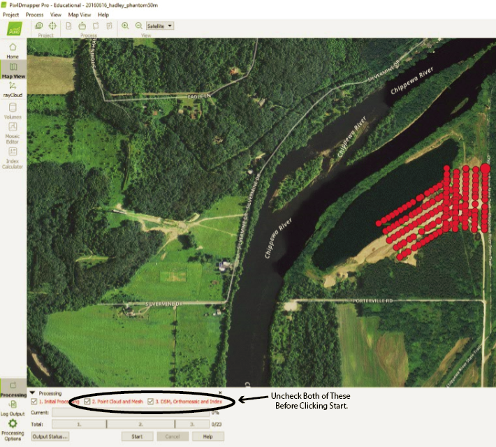
  It is usually smart to separate the initial processing from the point cloud, and DSM/orthomosaic processing. This way, if any issues arise in the initial processing, less time is wasted as processing can take a bit of time. To make sure that only the initial processing takes place first. The two check boxes need to be unchecked as shown on the right in figure 3.2. Separately, in the processing options window under DSM, Orthromosaic and Index options, the method is changed to Triangulation. Now. the data is ready for initial processing. Figure 3.3, shows where progress of the processing can be tracked. In this figure currently 8% of step 1 of 8 is complete.


Initial Processing Progress
Fig 3.3: Initial Processing Progress

Step 7: Examining the Quality Report

  After initial processing is complete, a Quality Report is automatically generated. This report lets the user know whether the data is ready for further processing or if it isn't. It gives details about the accuracy of the data. Below, in figure 3.5 is the summary section of the Quality Report. This summary includes the duration of the processing, the area covered, the time of the processing, the project name, the name of the camera, and the average ground sampling distance.


Summary of the Quality Report
Fig 3.4: Summary of the Quality Report
  Also in the Quality Report was a Quality Check section (Figure 3.5). This sections gives some more information about the processing of the data. The images used for this project overlapped well. This is noted by having 155 of 155 images calibrated. This means that none were rejected.

Fig 3.5: Quality Check Section of the Quality Report
  In the Quality Report, there was also a section about overlap. The image below in figure 3.6 was embedded within the report. It suggests that the overlapping was mostly very good as noted by the large green area. The outer fringes of the imagery is where the worst overlap occurred. This is because along the edges there were fewer images taken by the Phantom. Therefore, there were fewer images available for overlap in these areas. It can be expected that the yellow, orange, and red areas on the map below will have worse resolution than the green areas in the final product.
Fig 3.6: Overlap Section in the Quality Report.
Step 8: Start Point Cloud and Mesh, and DSM, Orthomosiac, and Index Processing
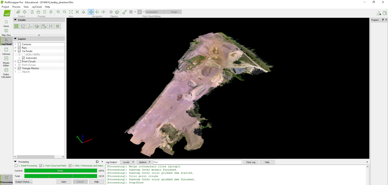
  If the Quality Report looks good, like it does in this case, the data is ready for further processing. To make sure Initial Processing doesn't repeat, that check box can be unchecked. Once the 2. Point Cloud and Mesh and 3. DSM, Orthomosaic, and Index boxes are checked the data is ready to be processed again. After this processing is complete, the data will be ready for map making.

Results/Discussion

Product After Processing
Fig 3.7: Product After Processing
  Once the processing was completed, the image shown in figure 3.7 was displayed on the screen. This image has very high resolution. In the window. one can zoom in and move around the Litchfield mine area. To better illustrate this, a short video (Figure 3.8) was created which takes the viewer on a flyby of the image Litchfield mine site generated by Pix4D. This video is a great way to help visualize the data. In the video, the immense detail can be seen in the trucks, trees, and sand piles. The video does a circle around the mine site zooming in and out at various points.


                                                                      Fig 3.8: Litchfield Mine Flyby Video

  The map shown below in figure 3.9 displays the orthomosaic overlaid with a hillshade of the Litchfield Mine. There are four main regions of the mine site: the northeast, the central, the south, and the southwest. In the northeast region, there are some sand piles, some roads, and vegetation is sparse. In the central region, large sand piles dominate. Vegetation is sparse in this area too. In some of the sand piles, one can see where the sand is being loaded into the trucks as the sand piles are not perfectly cone shaped. The south region contains the most vegetation. There are plenty of deciduous trees which are not really a part of the mine. The southwest region contains a large flat sand area with just a couple small sand piles. Overall, this map does a good job of displaying the the shape, size, location, and detail of the sand piles.
Orthomosaic Overlaid with a Hillshade of the Litchfield Mine
Fig 3.9: Orthomosaic Overlaid with a Hillshade of the Litchfield Mine
  A second map, shown below in figure 3.10 displays a DSM of the Litchfield mine. The highest elevation of the mine is 738 ft and the lowest elevation of the mine is 663 ft. The average elevation of the mine is 689 ft. Using the same regions as the map above, the northeast region is higher than the central region and contains a couple of sand piles. The central region is filled with sand piles, and therefore has the most varying elevation of the regions. In the south, there are some data errors. There wasn't enough overlap where the trees were, so the DSM displays that region poorly. In the southwest, there are a couple sand piles, and the elevation is sloping similar to the north region. Overall, the elevation is sloping towards the center region from both the north and the southwest. Also, excluding the deciduous trees, the sand piles can be seen with the very sharp contrast in elevation.
Digital Surface Model of the Litchfield Mine
Fig 3.10: Digital Surface Model of the Litchfield Mine

Conclusion

  In conclusion, Pix4D is a good way to process data collected from UAS platforms. The software has a nice user interface which with just given little direction can be easily used. Pix4D is a very powerful software. This lab consisted of creating DSMs and orthomosaics, but these are just a couple of things Pix4D is capable of doing. Creating the DSMs and orthomosaics from a collection of many images allows for data analysis which would otherwise be not possible. Another important aspect about Pix4D is the rapid check function. This allows the user to know if the data collection is of good quality while in the field. This can be very useful especially if the data quality is in question to start with.

Sources

Pix4D User Manual Desktop Manual PDF

Pix4D Quality Report Help

Thursday, March 2, 2017

Using Survey123 to Gather and Map Survey Data

Introduction

  The purpose of this lab is to learn how to use Survey123 by making use of an online tutorial. The Esri tutorial Get Started with Survey123 for ArcGIS walks the user through the process of creating a survey, completing and submitting the survey, analyzing the survey data, and sharing the survey. The survey created in this lab was based off of this Esri lesson. One goal of this lab is to summarize the process of creating the survey. Another goal is to display and describe the maps created from the data in the survey.

Methods

Create the Survey
Examples of Different Question Types.
Fig 5.0: Examples of Different Question Types.
 Survey123 has a very nice user interface which makes it easy to add questions to a survey. For this particular survey  a total of 29 questions were inserted. The questions added had to to do with HOA emergency preparedness. Different questions had different formats. This can be seen on the right in figure 5.0. For this tutorial the most common question type was Single Choice
  Some questions had followup questions if a certain answer was picked. For example, one of the questions was "What type of residence do you live in?" with the answer options of "Single family (house)" or "Multi-family (apartment, condo)". If the "Single family (house)" option was picked then the question "How many levels does your home have?" was displayed. If that answer wasn't picked then that follow up question wouldn't display.
  After choosing a question, the label, and answers had to be changed from the default settings. This can be seen in figure 5.1 below. Also, this is where the layout can be changed, and where the question validation can be deemed as required.
  All 29 questions were made by using various tools within the Add and Edit ribbons.

Edit Properties of a Single Choice Question
Fig 5.1: Edit Properties of a Single Choice Question
Completing and Sharing the Survey
Survey display on a mobile device
Fig 5.2: Survey display on a mobile device
  Once the survey had been published, to get some data associated with it, the survey was completed seven times with varying answers. The survey was taken twice on a mobile device, and five times through a PC web browser. Figure 5.2 on the right shows what the survey looks like on a mobile device. After the survey was complete on the mobile device, a screen saying "Survey Completed" popped up. This is shown below in figure 5.3.
Fig 5.3: Survey Completed 
How to Open ArcGIS online from Survey123
Fig 5.4: How to Open ArcGIS online from Survey123
  After this, the data was used to create a map in ArcGIS online. The map was created by first clicking on the Open in ArcGIS Map Viewer button under the Data tab under My Surveys.  This is shown in figure 5.4 on right. In the lower left of the image, the arrows points to the Open in ArcGIS Map Viewer button which when clicked upon opens up ArcGIS online. Data is also displayed in a tabular format on Survey123. The headings for the data can be seen in figure 5.4, but figure 5.5 below shows the downloaded .csv file which displays the data in an Excel format. Some of the data is hidden from view because the image would have been too large to show in its entirety. In ArcGIS online, some of the layer properties had to be edited so that the labels made sense. Once the map was made, it was shared to the UW-Eau Claire - Geography and Anthropology group.
Example of Survey Data in a .csv file
Fig 5.5: Example of Survey Data in a .csv file

Results/Discussion

 The name HOA Emergency Preparedness Survey Results was given to the map. The map can be found here. Also, a screenshot of it is shown below in figure 5.6. The map shows the locations of where the respondents said they were from according to where they placed their pin. Three points are around Minneapolis and St.Paul, and three are in Eau Claire. In the map, it looks like there is only one point in Eau Claire, but that is because the three points are so close together. The reason there isn't a point placed in Chicago is because there was no answer recorded for the map question in the survey by that survey taker.
Fig 5.6: Screenshot of the data displayed in ArcGIS online.
  Another map was created using the heat-map feature. This time, the map was created in ArcGIS online, but was then edited in Adobe Illustrator to give the map basic cartographic elements. The heat-map, shown below in figure 5.7, also shows where the respondents mapped where they were from. This heat-map does a better job of showing that Eau Claire is hot spot, The spot around Eau Claire is very intense/high because three of the respondents mapped themselves being from this area. There are a heat spot around Minneapolis and St. Paul as well because this is where other survey respondents are from. This map does a better job of representing where the survey respondents are located compared to the one in figure 5.6 because it gives the proper weight to Eau Claire, and because it is organized better.

Heatmap of Survey Respondent's Locations
Fig 5.7: Heat-map of Survey Respondent's Locations

Conclusion

  In conclusion, Survey123 can be a useful resource for collecting data. It can be used for many different things, including the GIS field as illustrated by this tutorial. Another example of using Survey123 could be if one wanted to know how much rain fell across Wisconsin on a certain day. A quick survey could be created asking how much rain has fallen and then could be sent out through email, and social media to generate the most responses. If many people responded to the survey, one could then map out the rainfall totals across the state of Wisconsin. Survey123 is a very neat survey as well, which makes people more inclined to respond and answer all of the questions. It is a good way to gather a lot of data in a relatively short amount of time.

Sources

EsriGIS, Get Started with Survey123 for ArcGIS
Survey123, Survery 123 for ArcGIS

Wednesday, March 1, 2017

Creating a Navigation Map

Introduction

  In this lab, one goal is to create two navigation maps which will be used in a future lab. Another goal is to understand coordinate systems and map projections. On the navigation maps, a pace count was included. Pace is a measure of every other walking stride and is usually measured per 100 meters. The pace used for this lab was measured outside Phillips hall along the sidewalk. Pace is just as important as direction on a navigation map. If a navigator knows his or her pace, then the number of paces can be estimated when walking between two points on the map. This allows the navigator to know if he or she has overshot, or undershot the intended target location.
  Coordinate systems are also important when creating a navigation map. For the navigation maps created for this lab, the WGS_1984_UTM_Zone_15N and NAD_1983_HARN_WISCRS_EauClaire_County_Meters were used. Both of these coordinate systems are well suited for the Eau Claire area. If a navigator chose to use a poor coordinate system, then when the navigation points are put on the map, the map will be too distorted to navigate with. Just as important as having a good coordinate system is having a good map projection. For the navigation maps in this lab, the Tranverse Mercator and Lambert_Conformal_Conic were used.

Methods

  Fist, a pace count was measured. 100 meters was measured on the sidewalk using a measuring tape on the south side of Phillips Science Hall. The pace was calculated twice to ensure accuracy. Both times, a pace of 65 was recorded. This means that every time 65 paces is taken, a distance of 100 meters has been traveled. Knowing this will be very beneficial during the navigation lab in the future. 
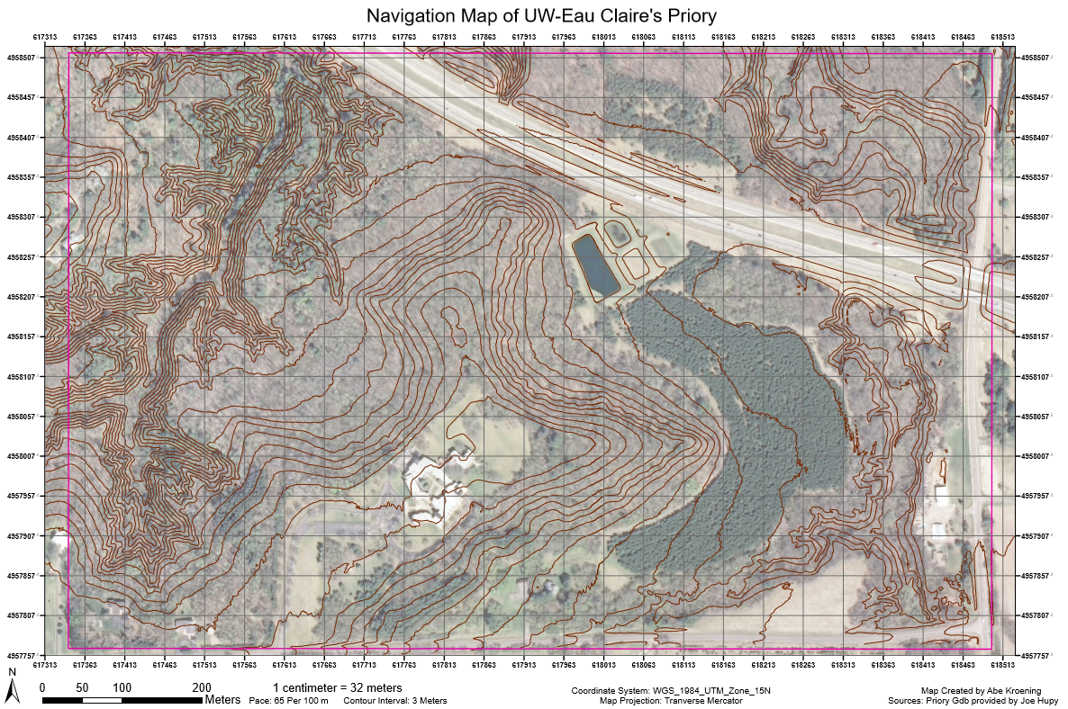
  After a pace was calculated, then the navigation maps of the Eau Claire Priory were created. Below, in figure 4.1 and 4.2 are the navigation maps.
Using the Times tool on the Lidar raster
Fig 4.0: Using the Times tool on the Lidar raster
  The contour lines were created in ArcMap using the Lidar raster from the mgisdata folder on the Universities Q drive. This tile didn't have a projection. With some guess and check work, the coordinate system was determined to be NAD_1983_HARN_WISCRS_EauClaire_County_Feet. Because the Lidar rasters had a linear unit of 1 foot, the pixel size was converted to meters. This was done using the Times (Spatial Analyst) tool. This tool is shown on the right in figure 4.0. The original Lidar raster was placed in the input box, the value .3048 was put in the 2nd box, and the third box is output box which displays where the output raster will be stored. The value .3048 was used because 1 foot is the same as .3048 meters. If this conversion wasn't done on the raster, then when the contour lines would be created, they would be in feet instead of meters.
  Next, every layer in the data frame and the data frame itself was projected to the same spatial reference. The data frame projection was changed using the coordinate system tab in the properties window while all of the layers in the data frame were reprojected using the Project tool.
  After these things were done, the study area raster, study area location, contour lines, and cartographic fundamentals were added to the maps with the exception of a locator map. Because the map is a navigation map, a locator map is unnecessary.

Results/Discussion

Navigation Map1
Fig 4.1: UW-Eau Claire's Priory navigation map using the Eau Claire county spatial reference
  The grid lines on this map above are placed one second apart from each other. The map layout was constructed to make the navigable map portion as large as possible. This resulted in a scale of 1:3,200. This means that 1 centimeter on the map is 32 meters on the earth. The contour interval of 3 meters was chosen because 3 meters is almost the same as 10 feet which is much easier to visualize. Also, a 3 meter interval doesn't make the map look too cluttered, but provides enough detail to get a general idea of elevation in the study area.
   The coordinate system for this map is NAD_1983_HAN_WISCRS_EauClaire_County_Meters. This was chosen because the study area is located within Eau Claire county, and the linear unit of 1 meter was wanted for the map scale. For this spatial reference, the linear unit was 1 meter, the false easting was  120,091 meters, and the false northing was 91,687 meters. The map projection was Lambert_Conformal_Conic was based off of the spatial reference. This means that the map projection conserves shape and direction. Also, this is why the graticule lines are intersect at 90°.
 A second navigation map was created shown below in figure 4.2. This map uses the WGS_1984_UTM_Zone_15N coordinate system. The reason for this choice is because the study area, shown in the pink rectangle, is located within this UTM zone. UTM stands for Universal Transverse Mercator. All values are positive as there is a false northing and easting. For this coordinate system the linear unit was 1 meter, the false easting was 500,000 meters, and the false northing was 0 meters. The zone 15N was chosen because the study area falls in zone 15 and is in the northern hemisphere. The only thing different about this map below than the map above is the difference in spatial reference, map projection, and the grid spacing and labels. The spacing between grid-lines is 50 meters. The map projection for this map is the Transverse Mercator projection. This is standard for all UTM maps. The developable surface is a cylinder tipped on its side at 90°. Generally UTM is a good map projection to use, as long as the correct zone is picked.
Navigation Map 2
Fig 4.2: UW-Eau Claire's Priory navigation map using the UTM zone 15N coordinate system
    Looking at elevation profile, there appears to be 3 main regions. The first region is located in the western part of the map. The contours suggest a very steep valley in this area, and is probably a small creek of some kind. The second region is the central region. Here there is a moderate incline in elevation leading up to the building, but looks only half as steep as the topography to the west. The third region is the eastern portion. This region as a few smaller hills, but is much flatter than the other two regions.
   Looking at the land-cover, there appears to be a dense pine forest in the south east central part of map. There is a building of some kind surrounded by an open area in the south central part of the map. The majority of the study area is dominated by deciduous forest, but there are two roads as well. One located in the very east, and the other in the northeast.

Conclusion

  In conclusion, navigation maps need to be constructed very carefully. In this lab, the default contour interval was based of the English system which needed to be changed. This was done by converting the pixel size on the Lidar imagery to the metric system. A navigation map should include only what is necessary to navigate. Those things include, north arrow, pace, scale bar, scale fraction, and grid-lines. The other parts of the map were included for citation purposes. Also, it is important to keep the coordinate systems/spatial reference consistent throughout the map. If it's not then distortion of certain map elements is likely and will make navigation that much more difficult. Navigation by map and compass is an important skill to know because sometimes technology isn't always reliable.

Sources

Esri Help, Conformal projection
Priory Gdb - mgisdata

Tuesday, February 21, 2017

Cartographic Fundamentals

Introduction

  This lab will focus in on the cartographic fundamentals of creating maps. These fundamentals include a north arrow, scale bar, locator map, watermark, data sources, and metadata. Without these cartographic elements, the map quality becomes poor, and the reader is left assuming things, or not knowing certain things. Most of these elements are pretty self explanatory such as a north arrow, a locator map, and a scale bar, but the rest are not. All a watermark consists of is the map creator's name which shows that they created the map. The data sources can consist of where the data came from, what tools were used to collect the data, and of other important information related to the data displayed on the map. The metadata can include what the data was collected with, an item description of the map, the extent of the data, and other important information.
  Part one of this lab will consist of revisiting the sandbox spline interpolation. Four oblique angles will be given of the spline interpolation. One hillshade will also be included. Emphasis will be put on including the fundamental cartographic elements. There will be some discussion about the patterns seen on the maps.
  Part two of this lab will include four different maps of the Hadleyville cemetery. The first one will show the year of death for each grave. The second will display the last name on each grave, the third will who whether a grave
is standing or not. The fourth map will be a graduated circle map related to the year of death for each grave. For each map, some discussion will be generated, and an emphasis will be put on including the cartographic fundamentals.

Part I: Sandbox Terrain

Fig 3.0: Sandbox Terrain. Oblique and Hillshade maps. Data collected in January of 2017

  Figure 3.0 shows the different maps of the sandbox terrain. The top four maps are spline interpolations created in ArcScene. The sandbox has our main regions which can be most easily seen in the hillshade map. They are the northwest, northeast, southeast, and southwest. In the southwest there is a large plains region with a small depression in the very southwest corner. This is the most boring region of the sandbox as elevation change is fairly minimal when compared to other regions. The southeast region has two main depressions, a small but steep hill, and has the main valley located in it. The northeast region contains the large ridge, and large depression. The elevation change between the ridge and the depression and valley is very high. The northwest region has a small valley, a depression, and a hill. The elevation changes between these features is not as great as the change in elevation in the northeast or southeast regions. Overall, the maximum height of the sand was 128 mm, the lowest point was 0 mm, the mean height was 67 mm, and the standard deviation was 25 mm.

Part II: Hadleyville Cemetery


Year of Death Labels
Fig 3.1: Year of Death by Grave at Hadleyville Cemetery, Data collected in September of 2016.
  This map displayed in figure 3.1 shows the year of death by grave at the Hadleyville cemetery. By eyeballing the year death labels, it looks like the oldest graves are located in the central part,in the western part, and in the extreme southeastern part of the cemetery. Younger graves are located in the northeast and northwest sections of the cemetery.

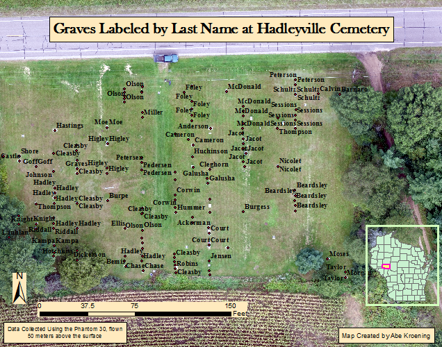
Grave Name labels
Fig 3.2: Last Name by Grave at Hadleyville Cemetary. Data collected in September of 2016
  The map above (figure 3.2) labels the graves with the last name of the person buried there. Generally, people of the same family tend to be buried in the same location. This holds true when looking at the map. For example, the Olson family is buried in the north northwest corner, the Beardsley family is buried in the southeastern area, and the Schultz family is buried in the northeast corner. Other than families being buried near each other, no other spatial patterns seem present.

Grave Standing Status
Fig 3.3: Grave Standing Status at Hadleyville Cemetery. Data collected in September of 2016.
  This map (shown in figure 3.3) displays the grave standing status. If the grave is standing, then grave circle is green. If a grave isn't standing, then a red circle represents it. If there isn't any data about the grave standing, then the grave circle is white. Surprisingly, only five graves were not standing. It seems that the grave status is linked to the family last name. For example, all of the Jacot graves don't have any data, while all of the Olson's, Schultz's, Beardsly, and McDonald's graves are standing.

Graduated Symobl Map
Fig 3.4: Graduated Symbol Map of the Year of Death by Grave. Data Collected in September of 2016
  This map displayed in figure 3.4 shows the year of death by grave in a numeric fashion. The larger the circle, the more recent the death. The small the circle, the older the death. Looking at the map, large circles tend to be grouped with large circles while small circles tend to be grouped with small circles. one example of this is in the northeast region where there is a group of large circles. Another is in the central region where there is a group of small circles. 
  In all of the Hadleyville cemetery maps not all the metadata is included. One piece of the metadata which is missing is the camera type which was used on the Phantom 30 to collect the data. Metadata is an important component which helps give the data useful background information.

Sources

US Census Bureau, Fact Finder
  https://factfinder.census.gov/faces/nav/jsf/pages/index.xhtml

Tuesday, February 14, 2017

Visualizing the Sandbox Survey

Introduction

Normalizing Data
Fig 2.0: Data Normalization
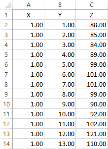
   Because this lab will build off of the previous lab, a short summary will be given of the last lab. During the Sandbox/Implementing Survey Techniques lab, elevation points were collected using a systematic sampling approach in a 114 cm² sandbox. Then, the elevation data was entered in an Excel document. Because of the grid set up and the systematic sampling approach, an X,Y, and Z field were used to specify the elevation points. This helped to normalize the data. Data normalization refers to the process of organizing the data so that it is clean and efficient. Doing this will allow the data to look plain and simple, and it will also decrease the likelihood of an error occurring. After normalizing the data, the Excel spreadsheet only contained the X,Y, and Z fields with the associated location and elevation values. Figure 2.0, shown right, displays some of the normalized values in from the Excel spreadsheet.
  The goal of this lab is to interpolate the elevation data using the spline, IDW, natural neighbor, kriging, and TIN tools in ArcScene. Using these interpolation methods will create a continuous 3D topographic profile of the the sandbox elevation. Because each method is different, each will be described in detail. Then, each interpolation will be exported into Adobe Illustrator so a map can be created. For each interpolation technique, a 2D map with a 3D orientation will be shown. The differences between them will  also be described along with distinct characteristics of each.

Methods

Importing Data
  Before interpolating the elevation data, first the data needs to be imported into ArcMap. This can be done by using the Add XY Data tool under the file menu. This will create a shapefile for the elevation points. However, the data needs to be part of a feature class. A new file geodatabase was created just for this. After converting the shapfile into a feature class, the data is ready to be interpolated in ArcScene.

Spline
  The spline tool was the first of five interpolation tools used. It creates a very smooth elevation profile. The spline tool works well with large samples because the greater the number of data points, the smoother the surface will become. There are two types of spline: regularized and tension. The main difference between the two is that regularized is smoother than tension when high values are used for the weight parameter. The advantages of using the spline tool is that it accurately represents the area when there are lots of data points. Also, the spline surface passes exactly through all of the sample points. The spline tool is not a good tool to use when there are not many data points. This is because the lack of data points can lead to an over generalization of the smooth surface.

IDW
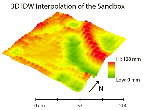
  Next, the IDW tool was ran on the sample data. Inverse distance weighing (IDW) uses the range of data values to interpolate. It is best, and advantageous, when used with very dense sample data because it gives lots of weight to the sample value and calculates all other parts of the surface based on a distance average. If the data is not densely populated it is disadvantageous to use. Each point will look like an individual peak or valley. This method does not work well with the systematic sampling approach used to collect the data for the sandbox. The data is not very dense and is evenly spaced, therefore each point would look like a peak or valley.

Natural Neighbor
  The natural neighbor tool was also used to interpolate the sample data. This tool works well with both equal and irregular spaced data. This is because the natural neighbor technique gives importance to the sample value, and has a smooth surface between the points. An important part of this technique is that it doesn't project trends. This can be somewhat disadvantageous as it only creates terrain directly reflecting the sample data. Because of this, there is a slight peak or valley at each sample point where this is a hill, ridge, valley, or depression.

Kriging
  The fourth tool ran on the sandbox sample data was the kriging tool. The kriging tool uses the statistical relationships among the sample points to generate a projected surface. It gives weight to the surrounding values along with the actual sample value. The kriging technique works well with scattered data. One advantage of kriging is that it predicts the the surface, and it gives the measure of accuracy. The surface is not just based on the sample points immediately surrounding the sample point, but also on the overall spatial layout of all the sample points. Another advantage is that it gives more weight to isolated points than points located within a cluster. A disadvantage of kriging is that it tends to overestimate the lowest points and underestimate the highest points.

TIN
  The fifth and last tool ran on the sandbox sample data was the TIN tool. Triangular irregular networks (TIN) create many non overlapping triangles composed of many nodes and vertices. One major advantage of using a TIN is that it places the nodes irregularly, placing more where the surface is highly variable. This allows for a higher resolution in important areas such as a steep slope in the sandbox from the ridge to the valley. However, this leads to a lower resolution in areas where the elevation is fairly flat. A disadvantage of using TIN is that it can be pretty inefficient when processing raster data. The TIN tool models the sandbox elevation very well. This is because the sandbox area is fairly small, and it measures the important features in higher resolution.

Exporting the Interpolations
  The next step consisted of exporting each interpolation method as 2D image into Adobe Illustrator. This was done because map elements cannot be added to the 3D images in ArcScene. Each interpolation technique was oriented in the same direction, and was exported with the same scale. This was done to make drawing comparisons between the interpolation methods easier. This will be discussed more in the Results/Discussion section. The orientation of every map allows for 3D analysis with only a 2D image.

Results/Discussion

Spline
  The spline surface represented the sandbox terrain very well. Looking at the map below (figure 2.1), the smoothness of the spline interpolation can really be seen. This is true especially when looking at the ridge line, and the valley floor.  There are just a couple of minor things which don't reflect the sandbox well. The spline method makes the plain area look not as flat as it did in the actual sandbox, and the depressions in the SW and SE corners look more bowl shaped than they actually are in the sandbox.

Spline Interpolation
Fig 2.1: Spline Interpolation

IDW
  The IDW surface, shown in figure 2.2, didn't accurately reflect the elevation of the sandbox. The ridge line and valley floor seem to be exaggerated and isolated to only the sample values and location. This was not the case in the actual sandbox, as the surface was smoother. Also, the elevation between each point in these areas didn't regress towards the mean elevation of the sandbox like the map suggests. The IDW interpolation seems to under-represent the depressions. There appears to be very little difference between the depression in the SW corner and the plain area to the NE of it. In the sandbox, the elevation difference seemed to be greater between these two features.

Fig 2.2: IDW Interpolation
Natural Neighbor
  The natural neighbor surface, shown in figure 2.3, reflected the sandbox elevation quite well. In general, the smoothness from point to point is much what the actual sandbox looked like. Also, the plain area looks very flat, just like it did in the sandbox. Although it's tough to see from this image, at each sample point along the ridge line and valley floor there is a slight peak. This part did not accurately reflect the sandbox. However, the impact is fairly minimal as it is difficult to notice it on a smaller scale such as the scale depicted in the map.

Natural Neighbor Interpolation
Fig 2.3: Natural Neighbor Interpolation
Kriging
  The kriging interpolation, shown in figure 2.4, didn't represent the elevation of the sandbox very well. Some of the depressions seem to have disappeared completely using this method. Particularly the one the SW corner of the sandbox. The two depressions in the SE corner of the sandbox have been inaccurately lumped together as a single depression. Also, it doesn't do a very good job of interpolating some of the smaller hills such as the one between the plain and the valley. One positive thing about the kriging method is that its roughness between elevation points actually helps it to look more realistic.
Fig 2.4: Kriging Interpolation
TIN
  The TIN interpolation, shown in figure 2.5, is pretty unique. It does a good job of representing the elevation of the sandbox. Unfortunately, a TIN cannot be displayed using a stretched color scheme so a classified one with nine classes was used. The TIN does a very good job of representing the ridge line, but not so much the valley floor. It makes it look like the valley floor doesn't have a level bottom, which it did in the sandbox. The TIN also does a good job of displaying all of the depressions, and hills.
TIN Interpolation
Fig 2.5: TIN Interpolation
Discussion
  The spline interpolation most accurately reflects the elevation of the sandbox. Its smoothness and lack of generalization is what makes it the best. Other methods eliminate, under represent, over represent, and/or combine certain features. The worst interpolation method is the IDW method. Because of the uniform distribution, sample points on a hill or depression are over exaggerated, and poorly represent the sandbox elevation. 
  If the survey was to be done over again, the same method would be used. The systematic approach used to collect data in lab one was well suited for all of the interpolation techniques. Although some interpolation methods worked better than others, the uniformity, and number of the data samples, allows for each method to be fairly accurate. Because our group's sampling method was very thorough the first time, it is unnecessary to do another survey of the sandbox.
Conclusion

  Interpolating the elevation data works well to help visualize the sandbox elevation. Each interpolation method interpolates data differently. Based on our group's systematic sampling approach, and by collecting numerous sample points, the spline interpolation represented the sandbox the best. The systematic sampling method used to collect elevation values from the sandbox can also be used in other field based surveys. Many field based surveys use one of the three sampling methods described in lab one: random, systematic, or stratified. The main difference between other field surveys and the sandbox survey would be the scale. The sandbox lab was a very small scale project. The sandbox was only 114 cm², but a real world survey could be 114 km². Because of this scale difference, it is unrealistic to perform such a detailed grid outlined survey when doing larger field based surveys. Measurements could not be taken every 6 cm at this large scale because of time and money concerns.
  Interpolation can be used for other data besides elevation data. A couple of examples are temperature, and precipitation. These can be mapped spatially with their associated values. The map surface would change similar to the elevation interpolation depending on the temperature or precipitation values.

Sources

ArcGIS Help. Esri