Introduction
 |
| Fig 2.0: Data Normalization |
The goal of this lab is to interpolate the elevation data using the spline, IDW, natural neighbor, kriging, and TIN tools in ArcScene. Using these interpolation methods will create a continuous 3D topographic profile of the the sandbox elevation. Because each method is different, each will be described in detail. Then, each interpolation will be exported into Adobe Illustrator so a map can be created. For each interpolation technique, a 2D map with a 3D orientation will be shown. The differences between them will also be described along with distinct characteristics of each.
Methods
Importing Data
Before interpolating the elevation data, first the data needs to be imported into ArcMap. This can be done by using the Add XY Data tool under the file menu. This will create a shapefile for the elevation points. However, the data needs to be part of a feature class. A new file geodatabase was created just for this. After converting the shapfile into a feature class, the data is ready to be interpolated in ArcScene.
Spline
The spline tool was the first of five interpolation tools used. It creates a very smooth elevation profile. The spline tool works well with large samples because the greater the number of data points, the smoother the surface will become. There are two types of spline: regularized and tension. The main difference between the two is that regularized is smoother than tension when high values are used for the weight parameter. The advantages of using the spline tool is that it accurately represents the area when there are lots of data points. Also, the spline surface passes exactly through all of the sample points. The spline tool is not a good tool to use when there are not many data points. This is because the lack of data points can lead to an over generalization of the smooth surface.
IDW
Next, the IDW tool was ran on the sample data. Inverse distance weighing (IDW) uses the range of data values to interpolate. It is best, and advantageous, when used with very dense sample data because it gives lots of weight to the sample value and calculates all other parts of the surface based on a distance average. If the data is not densely populated it is disadvantageous to use. Each point will look like an individual peak or valley. This method does not work well with the systematic sampling approach used to collect the data for the sandbox. The data is not very dense and is evenly spaced, therefore each point would look like a peak or valley.
Natural Neighbor
The natural neighbor tool was also used to interpolate the sample data. This tool works well with both equal and irregular spaced data. This is because the natural neighbor technique gives importance to the sample value, and has a smooth surface between the points. An important part of this technique is that it doesn't project trends. This can be somewhat disadvantageous as it only creates terrain directly reflecting the sample data. Because of this, there is a slight peak or valley at each sample point where this is a hill, ridge, valley, or depression.
Kriging
The fourth tool ran on the sandbox sample data was the kriging tool. The kriging tool uses the statistical relationships among the sample points to generate a projected surface. It gives weight to the surrounding values along with the actual sample value. The kriging technique works well with scattered data. One advantage of kriging is that it predicts the the surface, and it gives the measure of accuracy. The surface is not just based on the sample points immediately surrounding the sample point, but also on the overall spatial layout of all the sample points. Another advantage is that it gives more weight to isolated points than points located within a cluster. A disadvantage of kriging is that it tends to overestimate the lowest points and underestimate the highest points.
TIN
The fifth and last tool ran on the sandbox sample data was the TIN tool. Triangular irregular networks (TIN) create many non overlapping triangles composed of many nodes and vertices. One major advantage of using a TIN is that it places the nodes irregularly, placing more where the surface is highly variable. This allows for a higher resolution in important areas such as a steep slope in the sandbox from the ridge to the valley. However, this leads to a lower resolution in areas where the elevation is fairly flat. A disadvantage of using TIN is that it can be pretty inefficient when processing raster data. The TIN tool models the sandbox elevation very well. This is because the sandbox area is fairly small, and it measures the important features in higher resolution.
Exporting the Interpolations
The next step consisted of exporting each interpolation method as 2D image into Adobe Illustrator. This was done because map elements cannot be added to the 3D images in ArcScene. Each interpolation technique was oriented in the same direction, and was exported with the same scale. This was done to make drawing comparisons between the interpolation methods easier. This will be discussed more in the Results/Discussion section. The orientation of every map allows for 3D analysis with only a 2D image.
Results/Discussion
Spline
The spline surface represented the sandbox terrain very well. Looking at the map below (figure 2.1), the smoothness of the spline interpolation can really be seen. This is true especially when looking at the ridge line, and the valley floor. There are just a couple of minor things which don't reflect the sandbox well. The spline method makes the plain area look not as flat as it did in the actual sandbox, and the depressions in the SW and SE corners look more bowl shaped than they actually are in the sandbox.
IDW
The IDW surface, shown in figure 2.2, didn't accurately reflect the elevation of the sandbox. The ridge line and valley floor seem to be exaggerated and isolated to only the sample values and location. This was not the case in the actual sandbox, as the surface was smoother. Also, the elevation between each point in these areas didn't regress towards the mean elevation of the sandbox like the map suggests. The IDW interpolation seems to under-represent the depressions. There appears to be very little difference between the depression in the SW corner and the plain area to the NE of it. In the sandbox, the elevation difference seemed to be greater between these two features.
Natural Neighbor
The natural neighbor surface, shown in figure 2.3, reflected the sandbox elevation quite well. In general, the smoothness from point to point is much what the actual sandbox looked like. Also, the plain area looks very flat, just like it did in the sandbox. Although it's tough to see from this image, at each sample point along the ridge line and valley floor there is a slight peak. This part did not accurately reflect the sandbox. However, the impact is fairly minimal as it is difficult to notice it on a smaller scale such as the scale depicted in the map.
Kriging
The kriging interpolation, shown in figure 2.4, didn't represent the elevation of the sandbox very well. Some of the depressions seem to have disappeared completely using this method. Particularly the one the SW corner of the sandbox. The two depressions in the SE corner of the sandbox have been inaccurately lumped together as a single depression. Also, it doesn't do a very good job of interpolating some of the smaller hills such as the one between the plain and the valley. One positive thing about the kriging method is that its roughness between elevation points actually helps it to look more realistic.
 |
| Fig 2.1: Spline Interpolation |
IDW
The IDW surface, shown in figure 2.2, didn't accurately reflect the elevation of the sandbox. The ridge line and valley floor seem to be exaggerated and isolated to only the sample values and location. This was not the case in the actual sandbox, as the surface was smoother. Also, the elevation between each point in these areas didn't regress towards the mean elevation of the sandbox like the map suggests. The IDW interpolation seems to under-represent the depressions. There appears to be very little difference between the depression in the SW corner and the plain area to the NE of it. In the sandbox, the elevation difference seemed to be greater between these two features.
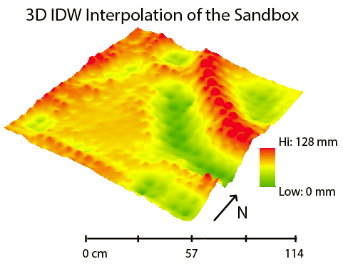 |
| Fig 2.2: IDW Interpolation |
The natural neighbor surface, shown in figure 2.3, reflected the sandbox elevation quite well. In general, the smoothness from point to point is much what the actual sandbox looked like. Also, the plain area looks very flat, just like it did in the sandbox. Although it's tough to see from this image, at each sample point along the ridge line and valley floor there is a slight peak. This part did not accurately reflect the sandbox. However, the impact is fairly minimal as it is difficult to notice it on a smaller scale such as the scale depicted in the map.
 |
| Fig 2.3: Natural Neighbor Interpolation |
The kriging interpolation, shown in figure 2.4, didn't represent the elevation of the sandbox very well. Some of the depressions seem to have disappeared completely using this method. Particularly the one the SW corner of the sandbox. The two depressions in the SE corner of the sandbox have been inaccurately lumped together as a single depression. Also, it doesn't do a very good job of interpolating some of the smaller hills such as the one between the plain and the valley. One positive thing about the kriging method is that its roughness between elevation points actually helps it to look more realistic.
 |
| Fig 2.4: Kriging Interpolation |
TIN
The TIN interpolation, shown in figure 2.5, is pretty unique. It does a good job of representing the elevation of the sandbox. Unfortunately, a TIN cannot be displayed using a stretched color scheme so a classified one with nine classes was used. The TIN does a very good job of representing the ridge line, but not so much the valley floor. It makes it look like the valley floor doesn't have a level bottom, which it did in the sandbox. The TIN also does a good job of displaying all of the depressions, and hills.
 |
| Fig 2.5: TIN Interpolation |
Discussion
The spline interpolation most accurately reflects the elevation of the sandbox. Its smoothness and lack of generalization is what makes it the best. Other methods eliminate, under represent, over represent, and/or combine certain features. The worst interpolation method is the IDW method. Because of the uniform distribution, sample points on a hill or depression are over exaggerated, and poorly represent the sandbox elevation.
If the survey was to be done over again, the same method would be used. The systematic approach used to collect data in lab one was well suited for all of the interpolation techniques. Although some interpolation methods worked better than others, the uniformity, and number of the data samples, allows for each method to be fairly accurate. Because our group's sampling method was very thorough the first time, it is unnecessary to do another survey of the sandbox.
Conclusion
Interpolating the elevation data works well to help visualize the sandbox elevation. Each interpolation method interpolates data differently. Based on our group's systematic sampling approach, and by collecting numerous sample points, the spline interpolation represented the sandbox the best. The systematic sampling method used to collect elevation values from the sandbox can also be used in other field based surveys. Many field based surveys use one of the three sampling methods described in lab one: random, systematic, or stratified. The main difference between other field surveys and the sandbox survey would be the scale. The sandbox lab was a very small scale project. The sandbox was only 114 cm², but a real world survey could be 114 km². Because of this scale difference, it is unrealistic to perform such a detailed grid outlined survey when doing larger field based surveys. Measurements could not be taken every 6 cm at this large scale because of time and money concerns.
Interpolation can be used for other data besides elevation data. A couple of examples are temperature, and precipitation. These can be mapped spatially with their associated values. The map surface would change similar to the elevation interpolation depending on the temperature or precipitation values.
Interpolation can be used for other data besides elevation data. A couple of examples are temperature, and precipitation. These can be mapped spatially with their associated values. The map surface would change similar to the elevation interpolation depending on the temperature or precipitation values.
Sources
ArcGIS Help. Esri
No comments:
Post a Comment